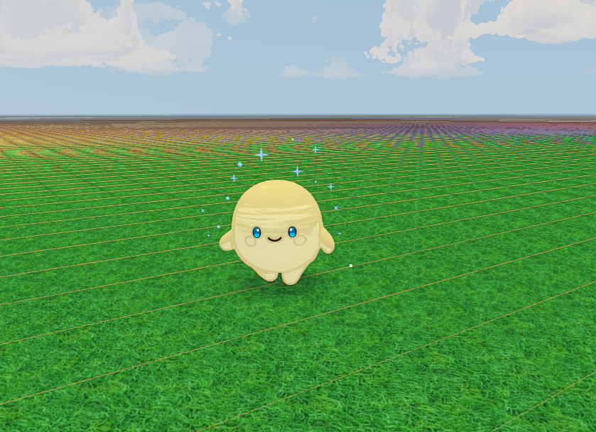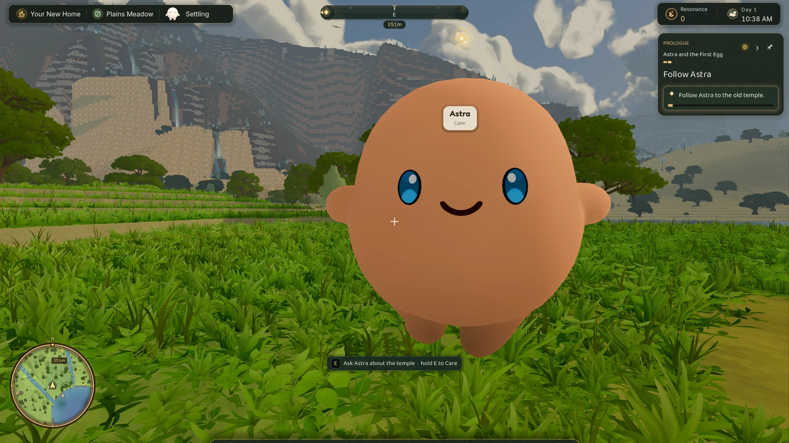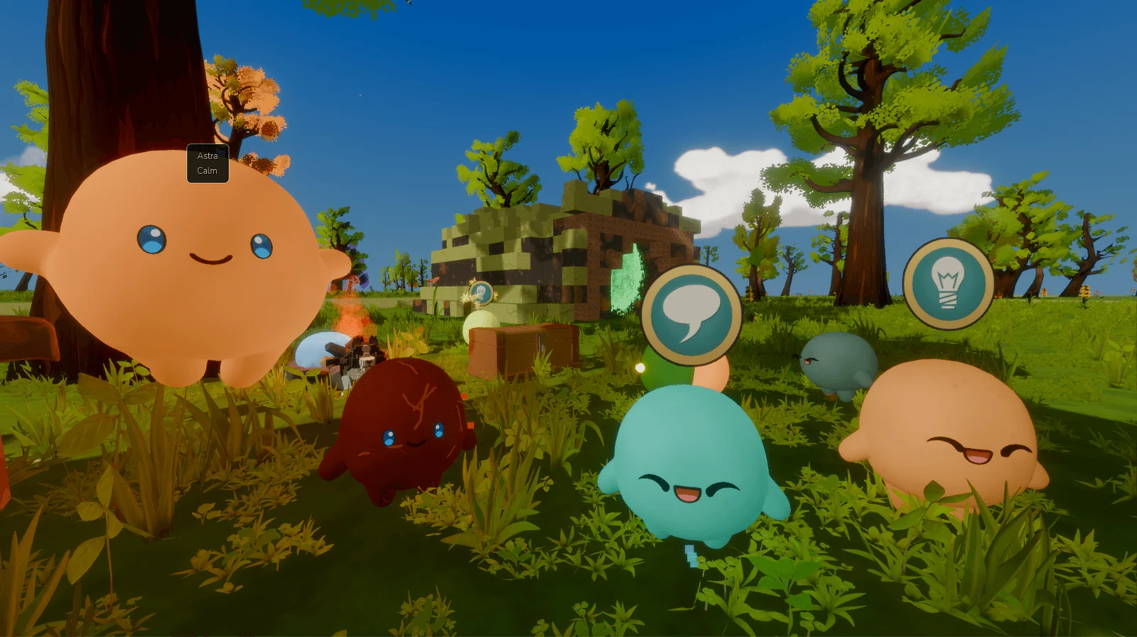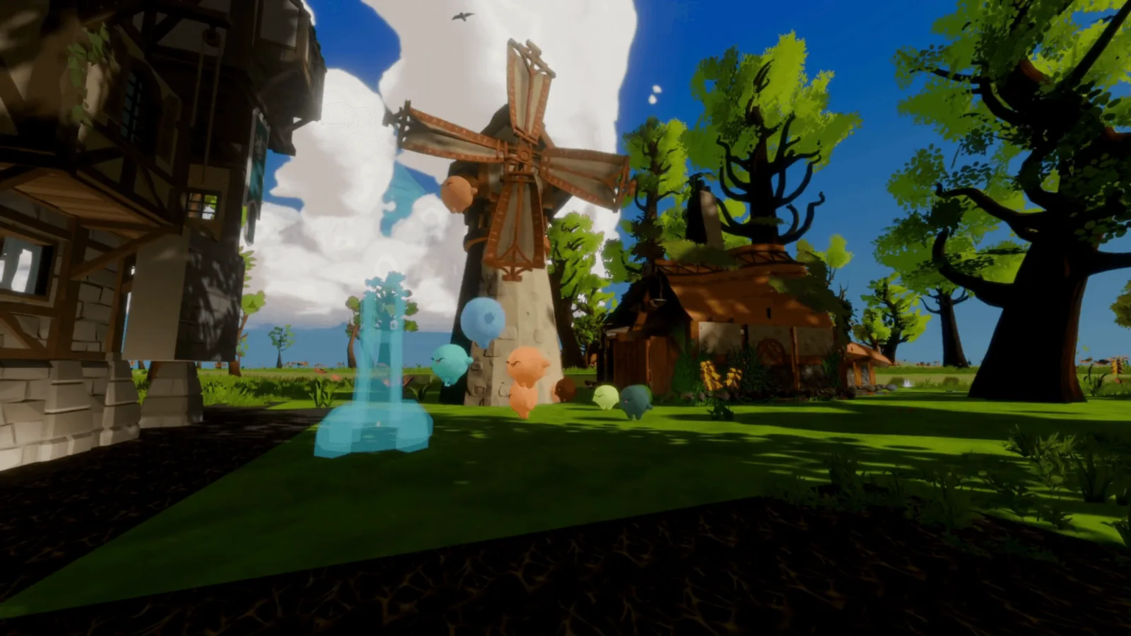


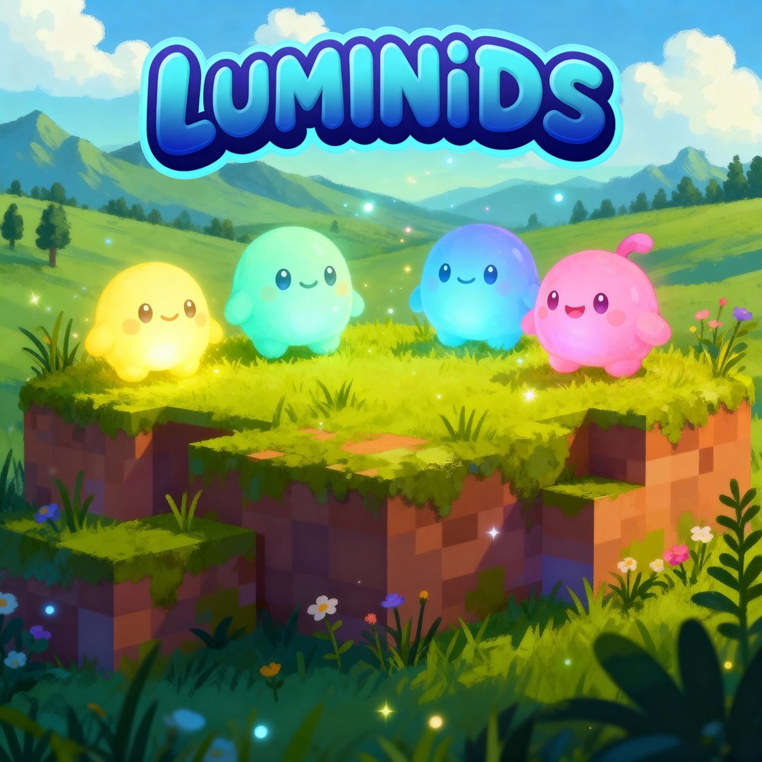
This week I finally sat down and pulled the Luminids visual identity into one system: colours, type, UI language, and rules for glow. I’d been adjusting those things one at a time for months, and what clicked is that most of it follows from one constraint.
The constraint everything follows from
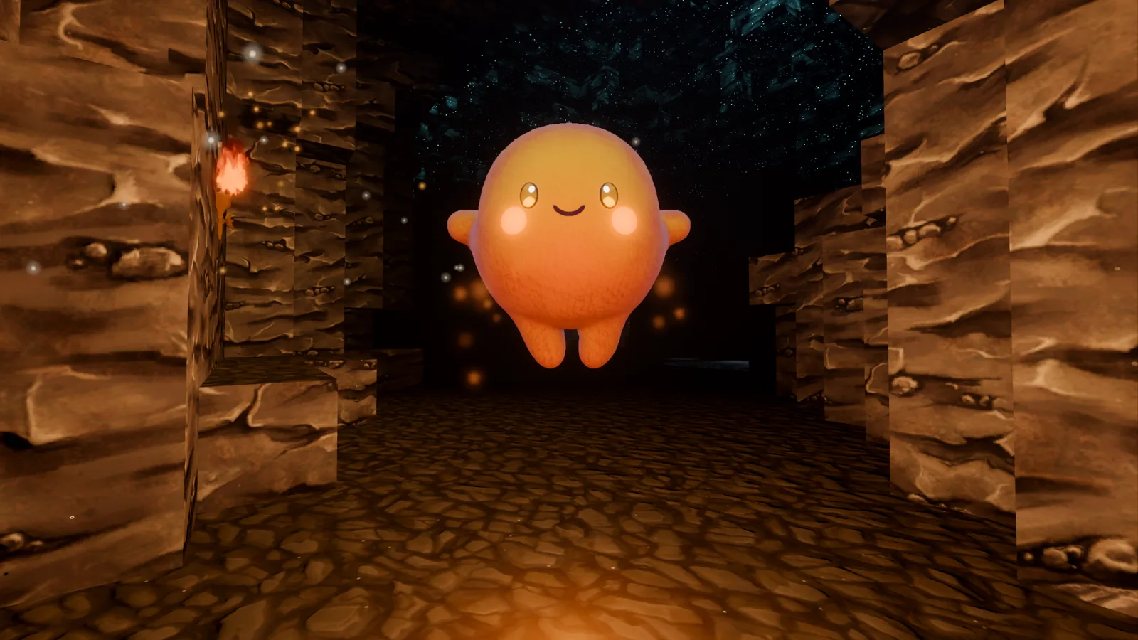
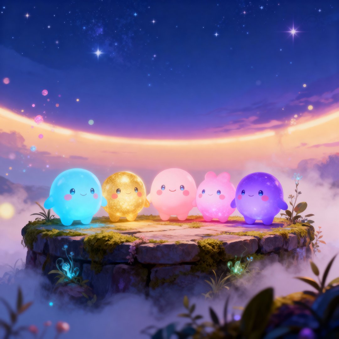
Luminids are creatures made of light. That means the background has to be dark, or they have nothing to glow against.
That one fact decides an unreasonable amount. It sets the palette. It rules out the bright, saturated look most cozy games go for. It makes glow the main expressive tool rather than colour. And every UI surface has to sit back far enough that a small creature glowing across the room is still the brightest thing on screen.
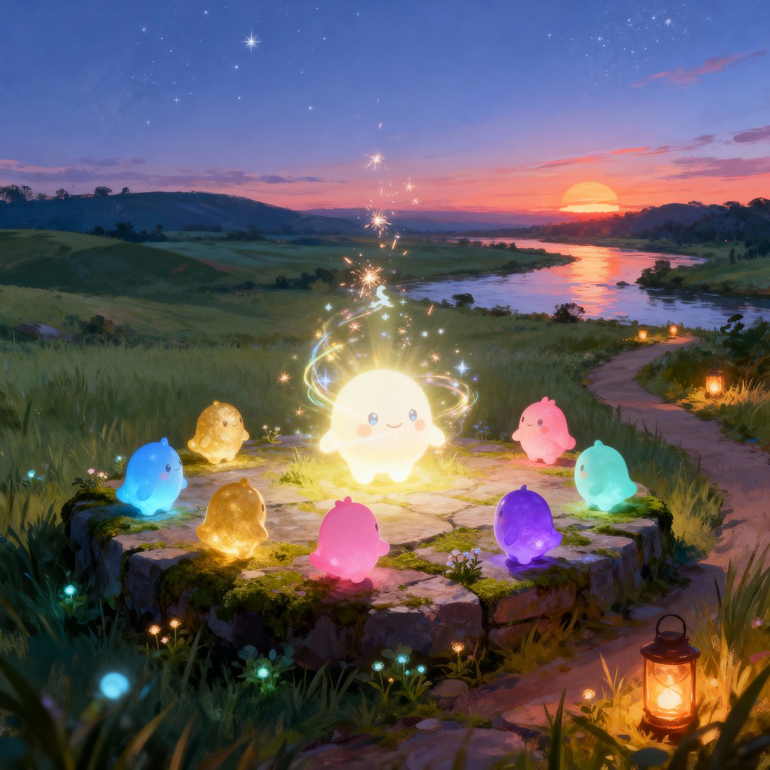
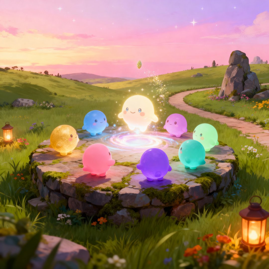
It also sets a trap, and I spent most of this week trying to stay out of it: dark plus glow slides into sci-fi very easily. Some of the tests below are me working out how much glow is too much, and how to keep a dark scene warm rather than cold. Getting that difference right turned out to be most of the art direction.
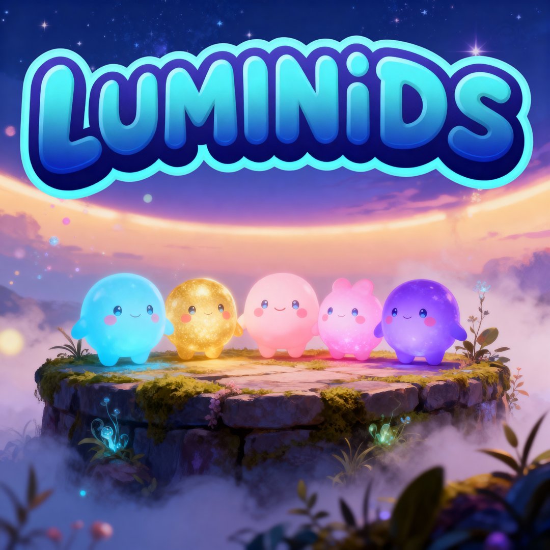

The palette
Three accents, two backgrounds, and three legacy colours I’m keeping around for specific jobs.
| Colour | Swatch | Usage |
|---|---|---|
| Core Accents | ||
| Luminid Blue | The hero colour, for buttons, highlights, and anything that needs attention without being harsh. | |
| Aurora Teal | Secondary accents and small highlights. It adds depth without competing with the blue. | |
| Luminous Cyan | Used sparingly, for the brightest glow moments only. | |
| Background System | ||
| Night Sky | The main backdrop. Very dark blue-grey, not black. | |
| Glow Grey | Cards and panels, one step up from the backdrop. | |
| Legacy Accents | ||
| Cyan Glow | Primary buttons and key highlights. | |
| Lime | Secondary buttons. | |
| Magenta | Used sparingly, for small magical moments. | |
If I had to point at one decision, it’s Night Sky being #0D1117 rather than pure black. On pure black, glowing things look like they’re floating in a void. On a very dark blue-grey, they look like they’re out at night. It’s a couple of percent of luminance, and it changes how the whole interface feels.
Type and voice
Inter Variable is the main typeface. It’s not a decorative choice, and that’s the point: with glowing creatures on screen, a neutral face keeps the interface from competing with the thing you’re meant to be looking at. It also stays readable at small sizes over busy backgrounds, which a more characterful face wouldn’t.
The writing takes its cue from the creatures: curious, a little cosmic, never shouting. If a line of interface copy sounds like it’s trying to create urgency, it’s wrong for this game.
The component rules
Atmosphere, and one rule about motion
- Glows are layered: cyan and blue at the core, teal around the edges. Layering is what stops a glow looking like a flat blur.
- Particles drift slowly in cyan and violet. Slowly is the operative word.
- Backgrounds drift subtly, like a sky that’s moving but not going anywhere.
- Interface animations breathe instead of bouncing.
That last one is the rule I’d keep if I had to throw away all the others. Bounce is energetic and attention-grabbing, and almost every modern interface reaches for it. It’s completely wrong here. A breathing motion eases in, eases out, and never quite settles, so it tells you something is alive without asking you to look at it.
The creatures themselves do bounce when they walk, as I covered in Dev Log 4. A walking creature and a menu have different jobs.
Why bother this early
Fair question, with the game this far from finished.
Every one of these decisions was going to get made anyway, a hundred times, inconsistently, in the middle of building other things. Deciding them once means I stop re-litigating the corner radius of a panel when I’m supposed to be fixing terrain.
It also gave me a test I can apply to anything new: does this feel like it belongs in a warm, dark, quietly glowing world where nothing is urgent? Most things fail that test, and now I can tell quickly.
Nick